Art Class 101

Friday, November 02, 2007

No New Posts

As you have seen I have not posted any new material for a while. Mostly because it takes time I don't have and all of you are equally busy and not able to post much feedback. So Maybe when we have more time and more interest we can start up again.

Wednesday, January 24, 2007

Up Next...+/-

Matt looks like you are having fun. Nothing like kids to inspire you to shoot and capture the moments of life 1/60th of a second at a time. They change so fast, I love to wonder back through the photos of the past 4 years and relive the moments. Ethan even asks to see pictures he remembers of thinks we have done. I hope more of you are ready to share your pictures. Matt and I have been having a great time but I need to know if the rest of you are getting left behind and need some hints or further explanation of thing we have covered so far. I know some of you must have some questions that have come up when you couldn’t get the results you were looking for. Let us see some pictures you have taken and tell us how they are not the results you were looking for maybe we can bounce some ideas around for you. Better yet lets see some of the shots you are really happy with. They don’t have to relate to an activity.

Then next activity I would like to talk a little about is exposure compensation. It is probably the first step in drifting away from full auto mode when the otherwise excellent metering of our cameras is getting confused or not giving the effect you want. It is my intention to slowly work into some real world examples you will come across while using full auto but not getting the results you want. Keep going back to the activity on composition because I think this is the best place to keep practicing to get away from the snapshot look. Explore angles other than the view form where you stand. We all know what the world looks like from this vantage point. Bring instant interest to you photos with some photos shot from down low or other creative angles.

Have a look at these links too

A Tedious Explanation of the f/stop - not really that tedious. If this is new, just take it slow.

Matt's Handy Photo Guide -- The Artistic Stuff - Related to Composition, a short quick read

A few pictures I have taken recently:
I keep practicing my panning, its just so much fun.

Looks like Emma's doing about 40MPH. Check out the little tuft of hair coming out of her hat.

Notice how the snow is a nice white in the first picture and little gray in the second. I need to adjust my Exposure Compensation (the box with the +/-)because all the white snow is messing with the auto exposure meter in the camera, it doesn't think there should be so much white in a picture. We need to tell it it is OK. Stay tuned...

Monday, January 08, 2007

Reese is one month old

I took this picture last night, and although in my opinion the light is too white and intense on Reese's left side, it still liked the contrast of the shadows it creates. Ted was telling me that he got some sort of a diffuser for his flash that softens the light of his flash. I think something like that would have helped this photo. I had the external flash pointing at a reflector back at Reese, while the standard flash was on him from the front. I did have some picture's that I like even more than this one, but this exercise was about using the flash, so I'll post others later.

Matt

Window Light

I took this picture with the same intent as the one of my Dad and the dog, but since the sun wasn't out, it wasn't as bright on my cousin's left side. I still appreciate the quality of the flash pointed at the ceiling and the window light.

Matt

Friday, January 05, 2007

Christmas photo

I took this shot, and by chance it came out with a lighting effect that I really like. I have the external flash pointed at the ceiling which gave enough light on the front of my Dad, but I also had natural light streaming in from a window on his left side. I have already tried to set up other shots like this since I have seen the results of this fluke shot.

Matt

Tuesday, December 19, 2006

Reese and Katie

I took this photo two nights ago, and really loved the picture. I had a black sheet for a back drop and the camera on a tripod with my external flash off the camera as a slave bouncing from the wall to ceiling so it would hit the subject from the top to their right side. With Reese laying down, this was not the best set up for lighting, but we had fun for alittle and got some neat shots, but still would have liked to play longer with lighting. The camera was only on the tripod for a short time as I had to move around to get good angles. So I post this one just because I like the interaction between Katie and Reese. I'll have more I'm sure, because there is something about being a parent that makes you want to show off your child to the world.

Saturday, December 16, 2006

Activity3: Flash options

This Activity will give you a feel for the options you have with your flashes.
I think you have all invested in an external flash, as pricey as they are, lets have them
start to earn their keep.
Keep in mind none of these examples are the wrong way to do it, they are all
tools you have to get the photo you want.

Example 1: Long exposure with natural light, no flash (1.0sec. @ F5.6)


Pros: A natural look, Subjects are 3 dimensional
Cons: Live subjects will move during a long shutter time and look blurry. Background light may become over exposed or subjects are under exposed because of bright background.


Example 2: Cameras built in flash(1/60 sec. @ F5.6)


Pros: To keep the subject exposed properly the camera throttled back the flash, this left
the back ground black, an effect you might what.
Cons: If you hoped to capture the background your out of luck, subjects also look very 2 dimensional because all the shadows are gone.


Example 3: Direct External flash(1/60sec. @ F5.6)

Pros: Same as with on camera flash except the flash has been raised up a few inches so the
models have a bit more dimension. The farther away the flash is from the lens the less chance
for red eye with people.
Cons: Same as with on camera flash but a bit better.


Example 4: Bounce off the ceiling with external flash(1/60sec. @ F5.6)


Pros: Looks more like natural light.
Cons: Shadows created by a direct overhead light are not always the look we want. Notice the change in light color because of the color of the ceiling. If you are farther away from your subjects the bounced light will not be as strait down.

Example 5: Bounce with a defector (1/60sec. @ F5.6)


The reflector I use is plastic and allows some light to go up and some to go to the models
Pros: Soft shadows with good dimension. Usually not obvious is a flash was used.
Cons: Not as much light went to the ceiling so background is dark. Flash is still in line with lens so not as much dimension as with natural light that was coming from the side.


Example 6: Bounce with reflector and long exposure(0.8sec. @ F6.3)


Pros: Might be the best of both worlds. This is basically fill light; it fills in some of the strong shadows you might get with natural light. This why it is a good idea to use a flash outside when is bright out. Not obvious a flash was used but the models are well lit.
Cons: Again we have a long shutter time so live models would blur from movement. It all depends on how much availlible light you have to work with.

To get the right exposure for example 6 I shut off the flash and left the camera in auto mode(Green mode or P on canon), so it calculated how long the shutter needed to be open, Then I went to shutter priority mode (Tv on canon) and entered in the shutter speed the camera just calculated it needed with no flash. Now I turned the flash on and took the picture in shutter priority mode. This gave the exposure I needed with some soft fill light from the bounce flash and plastic diffuser card.

Experiment over Christmas with all you friends and relatives see what you come up with. Then share your favorite results and tell us what you did and why you liked it.

PS Please pray for my back to get better soon. This has been hard on Sam and the kids too. Thankyou

Have a Merry Christmas!!

Monday, December 11, 2006

IT'S A BOY

Congratulations Matt and Katie

Sam, Ethan, Emma and I all got to meet Reese
Late Sunday afternoon.


Emma seems to like him already.

I didn't get a great picture of him so its
up to you Matt. Let us see your new boy.

Monday, November 13, 2006

What next?

This is a busy time of year, do you want new activities or just wait until after the new year? You can still work on the old ones, but if there is not much time right now for all of you we can take it slow. I want to post at least one more before the end of the year any suggestions on areas you might be struggling with. Lots of pictures to be taken around the holidays, mostly indoors with flash. Maybe a flash photograph activity. Let me know.

Thursday, October 12, 2006

This is Fun

Matt- It’s a lot of fun to know you are learning. It won’t take you long to start to see some of the different options that are available when composing a photo. You had some great elements in the picture. Keep up the great work. I hope you are having as much fun as I am. Can’t wait to see what you post next, hope others are enjoying this dialog and will add to it soon.

Thanks for the posts Tom and Jessica. Hope you have some self-portraits coming. Only composition tip to pass along to you is with sunsets and landscapes, most photography folks suggest not dividing you picture in half with the horizon. Try some with more sky or more foreground and see what You think.

If you get a chance I hope you all read over the link on composition in the activity 2 post. Just click on the word composition. It is short and easy to understand.

Keep Shooting!

-Ted

Thanks Ted

I have a lot to learn, and yes, your cropping is much better. I had the Rule of Thirds stuck in my head, but still didn't get a good picture. I did want the whole ladder, and the apples in the boxes, but the rest I didn't care about. (Even cropping me out would have been fine.) I still can see the rule of thirds in your cropping. Looks great.

Wednesday, October 11, 2006

Just a few thoughts for you Matt.

The bag of apples in the foreground is a bit distracting so I was glad to see that cropped out but the field next to you doesn't seem to add much and the ladder is a great vertical element so I cant help but think this should be a vertical shot.

OK, so I can't resist, what do you think of this cropping? It seems to bring together all the strongest elements of your picture. The boxes in the back seemed to get lost in the other picture but now make great background elements.


Tuesday, October 10, 2006

Matt's Cropping Exercise

Well, this has been a great assignment. I've never even heard of the Rule of Thirds, so this was huge for me. I don't have a great example, but I will at least be aware of this as I set up a shot. Thanks, Matt

This is the after:


This is the Before:

Tuesday, October 03, 2006

Tom's Posting for Assignment #2

I wish I could take credit for two of these but Jessica took them and she has been trying to school me a bit on the thirds law and using straight lines. I didn't crop these pictures because I think she did well with the composition on them. I took one of the pictures... can you guess which one? (one of these things is not like the others... but I like mine in an artsy kind of way) We took these on our way up to her parents cabin. It was so beutiful that I made us stop and take a picture.


Ted, I really like the way you made the guy in the go cart look like a professional by just cropping the picture. Very nice. I will get Jessica to take a couple of karate pictures to see if she can make me look good!

 Posted by Picasa

Monday, October 02, 2006

Ted: Sample 1

All I did to this photo is crop it. It is still cool to me what a difference it can make. This is the kind of thing I do all the time. As I get better I need to do less cropping, because I learn to compose the shot as I take them. Not only is it a great tool to improve composition but you can also learn what look you like by trying different crops. This is an example of a picture I took by panning with the car. Trying to maintain the same speed as the car so it was nice and sharp but the background blurred. This is the best out of many attempts but I didn’t get the car were I wanted it in the frame nor was I able to zoom as far in as I wanted. The great part of having the extra resolution of modern cameras is we can throw away a lot of pixels and still have great 5x7 or bigger. For the web all you need is about 72 pixels per inch.


Sunday, October 01, 2006

Activity2: Composition

This is what being a photographer is all about. It will separate you from the people who have cameras and take pictures. You will create Photographs. This is really Art. If any of you have an art background you know how much emphasis is put on composition. You are free as an artist to do what you want to…But we can not avoid the fact that most people will find you art work more appealing if you follow some guidelines. My hope is for you to very quickly start so see a difference in your photos. The sooner you see a big improvement the more motivated you will be. That’s what did it for me. You can make big strides with little effort in the beginning. None of this is really hard it just takes some time to train your mind to see the world differently, so don’t get frustrated. You will start to see the world differently.

  1. The first step is to read Ken’s articles on what makes a good photo and why your equipment doesn’t matter. The link is on the right under links, titled Great Photographs. I think he takes a lot of stress away and gives some great advice.
  2. Look through the photos you already have for this one. Try to find a photo that you have the subject in the dead center of the photo or one that you like the subject but not the picture. It will work best if you have a bit of background around the subject. Open the photo in a photo-editing program and start to crop it. Mostly keep the rule of thirds in mind and try to crop out anything in the background that is distracting. Also if your subject is facing or moving to the right or left give them “room” in the photo to look or move in that direction. These couple of thing will make a world of difference in the way your photos feel. Play with the cropping of several photos and show us the before and after of your favorites.
  3. Things to take away from this activity:
    1. As you crop you get closer to your subject. Learn to zoom in on the subject and keep backgrounds simple.
    2. Rarely does the dead center of a picture a good place to put the main point of attention.
    3. Give some “room” in the picture for the direction of movement or the direction a person is facing or looking.
    4. As you see what looks good after cropping you pictures start to crop this way as you shoot.
There is a lot of advice on the Internet on composition so read a little if you get stuck or confused. You can also look at pictures in magazines and take note of the composition of them.

Tuesday, September 19, 2006

B/W Sample


I'm sure that my software doesn't have this capability, but it is very interesting to know, since I really love black and white photography. Thanks Ted. I also had a chance to take some portraits at a family reunion this last weekend, but most fun were of some of kids running around. I'll post one of Katie's cousin whom I snuck up on.

I also bought some material for portrait back drops. Who knows, soon I might actually buy a computer and photo software.... No, probably not.

Matt

Monday, September 18, 2006

Convert to Black and White

Here is some details on converting to black and white. Its not to in-depth and I dont think any of you have photoshop CS. If you have Photoshop elements you should be able to try these. I have a cheap program called PhotoImpact Pro and it supports the stuff Ken is talking about. I just have to play around a bit more. It is best to start with a color photo then go to black and white. You will have the most flexibility. This will give you a good feel for the different looks you can get with the same color photo as you convert it to black and white.
http://www.kenrockwell.com/tech/photoshop/b-w.htm

Sunday, September 17, 2006

Happy Birthday

Art Class 101Happy Birthday Ted and a Happy Anniversary to you and Sam!

Also a Happy Birthday To you Tom!

Friday, September 15, 2006

Matt Activity 1


Art Class 101 I'm just posting two photos, the one on the left was with an external flash as a slave, and the standard flash on the camera. The one with the dress shirt was with natrual light. It has too much light on the right, and I used a reflector to limit the shadow from the left, but I wasn't able to review them until this morning at work. Had I seen the results, I would have reduced the light on the right, and not used as much light reflecting on the left of the face.
Having fun, and learning about my camera! Thanks for organizing this.

Monday, September 11, 2006

Activity1: Second Example


Here is a shot to show the difference in depth you can get. I don't think one is better than the other you just have to decide what look you are going for. This one has a little flatter look because you have more light from another window filling the shadows. When you have less light it is far more important to make sure it is falling on all the right places, when it does you get a great 3D Look from the Black and White. This one is still much more depth than you would get using the on camera flash insted of window light. You might want to try one with the built in flash as you take these just to see it for your self.
Fun hey.

Sunday, September 10, 2006

Ted

Ok so I took a few shots today, wont say how many but I did a quick conversion to Black and White and a little cropping on one that was Ok. Thought I would try this Blog thing out. Have no idea if I am doing it right but we will get the hang of it.

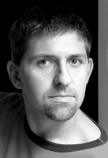
I think I will post another at some time but this is a test and the shot should give you an idea about what I was thinking. I don’t want to limit your creativity but you should try window light it is cheap and works well. I liked the contrast, very light and very dark. I might convert to BW different way and see if the results are noticeable or not. Some of my other shots have light from another window on the shadowed side of my face and I think it was too much. Didn’t seem as bold as this one.
Ok so lets see what you guys are thinking.

Lets try this format and see how it works.

Saturday, September 09, 2006

Art Blog


Check this out and see if it is something that you think we could use to view all of the photos.

Here is our dog Noah. 115 lbs of puppy and growing!